Getting the most out of your sign – 5 tips & tricks
Blog
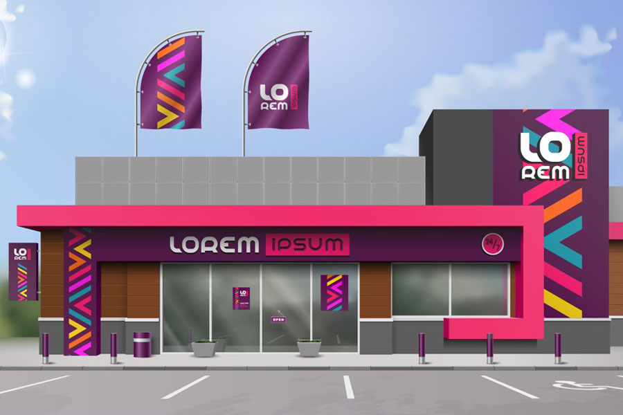
Creating a sign that has the perfect balance of fonts, images, colour and design requires following a few ground rules. Here are our five best tips for designing signs that drive home your message instantly and memorably.
1. Hierarchy of Wording
Make sure that the most important text is either at the top or is in the largest font, and the least important is in the smallest. That way, if someone glances at the sign for only a few seconds they know the purpose of the sign.
2. Alignment
If you are designing a sign with text and photos it always makes a design more appealing to look at if the elements in the design are lined up. (i.e. if your text is in the centre, your photo should be in the centre as well)
3. Colour Contrast
It is important to make sure that the colour of the text and the background of a design have enough contrast. When the colours are too similar, it makes the text hard to read and they can blend together if someone is reading the sign from a distance.
4. Design Elements
Sometimes in a design less can be more. Keeping the number of design elements (photos, text, clip art) to a minimum helps create a sign that is clean and easy to understand.
5. Number of Fonts
Different fonts can be fun to play around with, but too many different fonts in one design can make it look unorganized. Limiting the design to one or two fonts makes everything look more cohesive and keeps the text easier to read.
Are you considering new signage for your event or business? The friendly team at SiteSmART can help with expert advice! Give us a call on 1 800 03 12 04 to discuss your requirements. Alternatively, complete the Contact form here and we will contact you.